Bazm-e-Virasat

Bazm-e-Virasat is envisioned as an annual celebration dedicated to nurturing and preserving the rich cultural and literary heritage of Allahabad (now Prayagraj).
The Branding of Bazm-e-Virasat is a thoughtful blend of historical and cultural elements that capture the essence of Allahabad’s (now Prayagraj) rich heritage. The stone background, signatures of renowned personalities, and the fusion of Hindi and Urdu calligraphy come together to create a powerful visual narrative, setting the tone for a celebration of the city’s legacy.
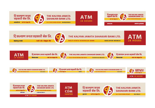
The Kalyan Janata Sahakari Bank

Marking the beginning of the 50th year, they launched a new logo with a progressive approach of chasing new goals with changing times. They believe in growing together with a hand in hand approach of experienced and young staff resulting in giving seamless services through both traditional and digital banking. Keeping the roots and values intact, we follow the principles of Truth, Trust, Teamwork, Traditions & Technology.
BRICS Summit 2016

The committee invited Logo designs from across the country for use during India’s Chairmanship of BRICS in 2016. My Logo Design got selected amongst the 1400 entries across the country. In the Logo, the Lotus symbolizes Glory, Prosperity, Unity and Eternity and also it’s a National Flower of India. The concept line behind this logo is, Welcoming the leaders of Brazil, Russia, China and South Africa to India, with a humble, traditional and a respectful gesture “Namaste” to lead our way to prosperity with unity.
In Association with Quantastic Marketing Pvt Ltd.
Maitri Constructions

Maitri Constructions is a Real Estate Company based in Mumbai. The Logo highlights the meaning of the word Maitri which means friendship. It also takes the shape of a square, as every property is measured in square feet. There are various other aspects covered in the logo which is highlighted in the Video.
The Big Fish & Co.

The Big Fish & Co. is an authentic Konkani-Goan style sea-food restaurant located in the heart of Mumbai, near Shivaji Park. The Brand is owned by renowned Actress Shreya Bugade, Ujwal Samant and Yatin Khanolkar. The Logo creates a unique brand personality giving it a vintage look and feel with a modern touch.
Anukool

Anukool India Pvt Ltd (AIPL) was founded in 1999 with an objective to offer “design-build” solutions in air-conditioning. What started as a small dealership business in Mumbai, has now grown into a pan India MEP solutions enterprise. The Monogram is created with the Initial A taking a shape of an Upward Arrow symbolizing the speed & growth of the company. It also carries another important factor of showcasing Togetherness & Team work.
Shree Kala Sanskar Nyas

Shree Kala Sanskar Nyas is a cultural community based out of Dombivli, Mumbai. It’s primarily a Drama institute started to promote the awareness of theatre. The Logo is a Devnagari Ligature of the Initials “श्री क सं” which symbolizes the bonding of the people collectively contributing towards the work in Cultural, Social, and Educational domain.
Rusty Rickshaw

The Rusty Rickshaw is a band that is an amalgamation of different cultures and styles of music. I have attempted to combine elements that symbolize the styles they use. Rocky grunge effects with soulful arabic lettering, graceful elegant curves and rustic devanagari script reflecting their Indian roots. All these come together in an eclectic fusion that forms a logo personifying the Rusty Rickshaw.
Saharsha Clinic

Saharsha Clinic, speciality care of women & children is a pediatric and gynecology clinic of Dr. Vivek Karambelkar and Dr. Chetana Salunkhe Karambelkar. The Branding of the clinic captures the essence of the emotions that Women and Children have and it creates a comfortable atmosphere for both.
Coffee Gruham

Coffee Gruham is a Cafe based in Mumbai. In the logo, the form of a house and the coffee cup has been merged to make an interesting symbol. The font has a hand lettering personality which brings a retro vibe to the logo design. Design elements like coffee bean and the coffee froth have been also used to create a visual balance. Overall this symbol gives a unique retro personality to the Brand. The entire theme has been created with a Sanskrit inspiration blended along with a casual language to target Gen Z.
Rievera

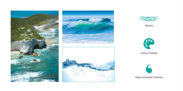
Based in Italy, Rievera Paints offers best in class products to their customers and supply to leading OEMs and developers in India. 'RIEVERA' - is an Italian word for a coastline, sea coast. An icon in the form of ‘Waves’ has been used to convey this reference to the coast. A minimalistic form of a palette represents the City of Artists, Italy. A palette is an object which is used to create numerous permutations and combinations of shades and soon a totally new colour tone takes birth. This sums up the essence of the brand - Rievera.
Policy Access

The logo design encompasses an element of Speech bubble highlighting the thought that Policy Access would drive a conversation with the government on behalf of the companies. Also an element of an upward graph is incorporated to show the impact and growth that the services of Policy Access would create for the companies. All of it is created in a manner that it takes a shape of the initials P & A minimally. Along with the Typography the overall unit is forward leaning. It graphically portrays the acceleration and speed.

Taxteck is a new-age tech-enabled tax advisory firm that is engaged in developing tax tools. It is spearheaded by two Chartered Accountants supported by a team of engineers. Our vision is to seamlessly integrate technology with taxation and help companies in completing their compliances in a timely and effective manner.
Taxteck
Indraneel Shelar

Indraneel Shelar, a Still Documentarist and a Photography Tutor. His expertise lies in the fields of travel photography, events, corporate brand campaigns and landscape photography. The logo is a monogram formed with the initials ‘I & S’. The corners of the alphabet ‘S’ represent a form of camera focus along with a curved line in the middle which signifies his journey of photography. In a nutshell, the logo bears a resemblance to a framed artwork with a balanced composition and space.
Samero Instawash

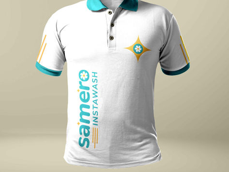
Samero Instawash is a Laundry service business located in Mumbai. The Wordmark brings a soft character making it visually pleasing like touching a soft fabric. The Shine icon adds a fresh and clean visual feel and the placement of the same also makes it read as Sa Me Ro. The Aqua Colour with a tinge of yellow brings a fresh and soothing feel to the Logo. Not only does it relate to the nature of business but it also brings a feel good factor that a fresh laundry gives.
Bhakti Interioprop

Bhakti Interioprop deals in Interior Executions and also conducts workshops on the same. It’s more of a design based symbol having the Solid Letter ‘B’ and an opening door incorporated within. It personifies that the service of Bhakti Interioprop not only opens doors to the beautiful houses and properties but also opens doors of opportunities for newcomers by conducting workshops. As the Company believes in having Contemporary Style, the form has been created accordingly giving a modern feel with a minimal execution.

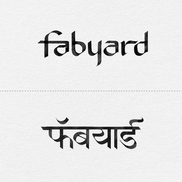
Fabyard is a Company dealing with creative solutions for every home with fabrics.we provide a bouquet of a wide range of fabrics for furnishing including curtains, and upholstery fabrics. The name itself stands for the concept of giving door-to-door service to the clients showing them how Fabric can blend into everyday lives.
Fabyard
Orange Vibes

Orange vibes is an art space where every wall is a backdrop. A space with a cozy atmosphere and creative interiors. The motive of Orange Vibes studio is to provide a dedicated space for various forms of Art such as Photography, Poetry Reading, Script Reading, Storytelling for Film Makers, Community Meet-ups, Workshops, etc. The name Orange Vibes is inspired by what the colour orange represents. It symbolizes true vibes of joy, warmth, creativity, enthusiasm, determination, enjoyment, fun, freedom, expression, happiness and success.

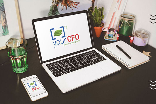
Your CFO is a Financial Management Company. In the Logo Design the 3 blocks symbolize the wads of cash showcasing the financial aspect. Simultaneously, it also forms the shape of steps which portrays growth. It gives an idea of how easily an organization can grow financially step by step in association with ‘your CFO’. The wads of cash are given an Exponentiation. This symbolizes how ‘your CFO’ partnering and consulting with the company will exponentially increase their financial growth.
Your CFO
Cake Studio

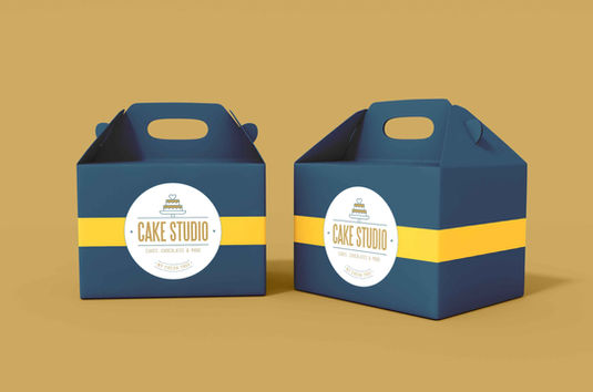
Cake Studio, the name itself conveys the nature of business. In the Branding the logo type has been made to stand out in a classier way symbolizing the rich quality of the cakes and chocolates made by the brand.
Chahabaaz

Chahabaaz, a small tea shop in Mumbai. The Logo in Marathi brings a shape of hot tea cup in th letter ‘ह’. Overall the logo has a playful, energetic personality just like the one gets after drinking a cup of tea at Chahabaaz.
+91 96648 38542
© 2023. Copyright Sudeep Gandhi.
All Rights Reserved. Designed by
Aadya Aesthetics x Sudeep Gandhi


